Writing Sample for Brilliant, Data Science Producer
Submission Type: Blog Post
Scientists are great with data. They love it. They’ll happily spend their evenings in their labs, collecting their precious data, meticulously notetaking or just watching a tool tick towards completion. Years or months later, when they finally emerge with the data they were hoping for, they rejoice in excitement and can’t wait to show you. There’s so much data, and it’s good! The trends go the right way and the statistics are sound!
The problem is, they aren’t always great at explaining that to others.
They’re disappointed when you aren’t excited too. But you haven’t sat in the lab with this data for months. You haven’t thought about it until today.
When I was a PhD student, and even now working in industry, this was the world that surrounded me. Even with an advisor who loved a good, crisp data story as much as I did, we could not escape the hour-long presentations of endless slides, one plot after another, no cohesion and no clarity for the audience.
Here is a plot. Here is another plot.
We collected the data we sought to collect.
Success.
Applause.
As someone who spends her weekends writing fiction or painting urban landscapes, I spent most of my career feeling like no one else saw data as a story. That wasn’t true, of course, but it sparked in me the need to show others the beautiful ways in which art, storytelling and data are all connected.
I’m lucky enough to teach a class on this topic at RIT, and have led presentations on effective data communication for my team at Intel, but that’s not helpful if you aren’t a college student in Rochester, NY, or an engineer at Intel. Here, I’ll share a few tips that you can take with you to help your audiences be as excited about your data as you are.
Effective Visualizations
You can transform your visualizations by following five guidelines:
- Don't be afraid to use text: titles, axis labels, legends. These help clarify meaning and create context for the viewer.
- Use whitespace to help a visualization look cleaner.
- Use color sparingly and for a reason (Focus Attention)
- Avoid unneccessary clutter (i.e. background images, gridlines). As much as possible, every drop of ink on the chart should relate to your data.
- Tell a story.
Here, I will go into detail on two of these guidelines that will help you quickly improve the effectiveness of your visualizations and how you present them: focusing attention and telling a story.
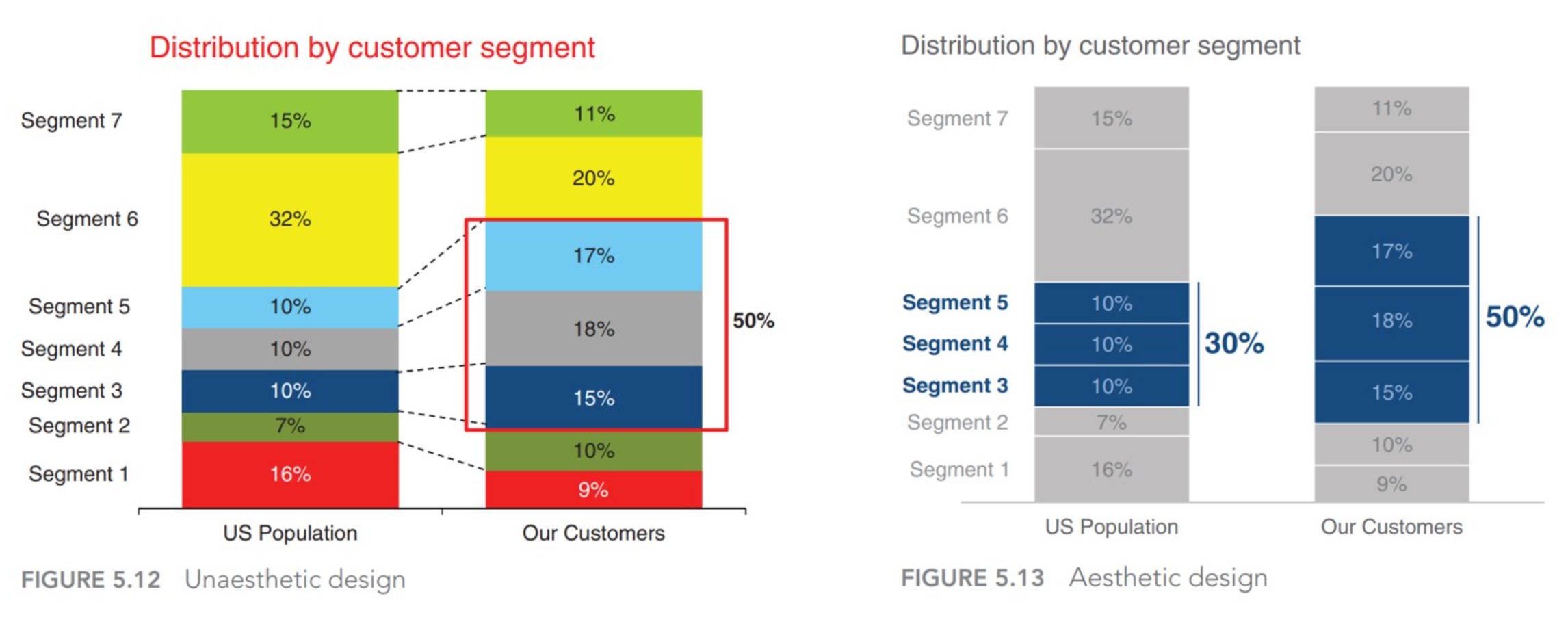
To start off, for an example of effective transformation from an overly saturated and colored bar chart to a more effective and visually appealing visualization, I point you to this chart makeover from the Storytelling with Data website.
The transformed chart:
![]()
Think for a moment. How does the chart on the left make you feel? How about the one on the right? Hopefully, the chart on the right puts you at ease, and it does all of the hard work for you. You don’t have to guess at the intended message, you don’t have to hunt for comparisons between the bars, and the colors don’t stress you out like the huge chunk of oversaturated red on the left.
1. Focus Attention
Data visualization is closely connected to neuroscience. This may suprise you, but the key to a good visualization is understanding how the brain works. At a very basic level, when you take in visual information, your brain kicks in to see (perception) and simultaneously to think (cognition). While thinking is certainly not a bad thing, cognition is much, much slower than perception. Visual perception is essentially automatic and happens in your sub-conscious, so it takes very little energy. Often, especially in the Data Viz community, it is called “pre-attentive processing.” On the other hand, cognition is slow and requires conscious, deliberate, focused thought as well as much more energy. Cognition is also called “attentive processing.”
Why does this matter to us? It matters because we can use these distinctions to our advantage to improve the effectiveness of our visualizations. To do this, all we need to do is make a visualization that envokes more pre-attentive processing than deliberate thoughts. If successful, when someone looks at our visualization, they will be able to understand it very quickly and easily just by “seeing”, without having to expend additional time and energy to think about what they are seeing.
A lot of research has been done on the visual properties that best use pre-attentive processing. I especially recommend Colin Ware’s book “Information Visualization: Perception for Design.” According to him, the four best pre-attentive visual properties are: color, form, movement, and spatial positioning. This makes sense: you don’t need to spend a lot of time and effort to recognize if there are two separate columns of text on a screen, for example, provided they are spaced far enough apart and not too cluttered with extraneous distractions.
To drive this point home, consider the power of using color to draw attention using pre-attentive processing. This technique is often called popout.
In the abstract scatterplot below, the large difference in color between the muted grey and saturated red dots makes it very easy to use pre-attentive processing to instantly recognize the difference and draw your eyes to the red dot.

It’s the same concept that’s used in photography or visual art to draw the viewers’ eyes to a specific point of interest. Contrast.
Where are your eyes drawn in the photograph on the left, below? How about the one on the right?

Most likely, your attention instantly goes to the big, red stop sign. But for the image of the umbrellas, there is very little focus. Likely, everyone’s eyes will be drawn to a different place. There is no focus point, and pre-attentive processing is minimized. Think about some ways that this image could be improved to enhance its focus and optimize the viewers’ pre-attentive processing.
Finally, consider how we might take advantage of this concept in a real visualization by comparing the left and right charts below.
Which one do you find easier to understand?
2. Tell a Story
The final trick to a compelling visualization is understanding the importance of story.
Just like a novel, data has a narrative. If you ignore that narrative, no matter how pretty your visualization is, no one will remember it.
Like a novel, data has a beginning, a middle, and an end. Or, perhaps more interestingly, a plot, a twist, and an ending. For more details, take a look at The Structures of Story from the same Storytelling with Data site. As Cole Nussbaumer Knaflic describes in her incredible Talk at Google, the story of data can be broken down into the following:
- Plot: What context is essential?
- Twists: What is interesting about the data and what it shows?
- Ending: What do you want your audience to do?
You can also think of “twists” as a story’s climax, and the ending as a resolution. A call to action.
And, like any novel or piece of art, you have to think about your audience. The Plot, Twist, and Ending will vary greatly depending on who you are talking to.
It’s very easy to share about your data in the chronological order that it affected you. I began to explore the data, I found some initial results. I refined those results. I made some conclusions. Here they are.
I’ve seen this hundreds of times in hundreds of presentations over the years.
That may be your story, but that is not the story of the data itself.
For now, I leave you with this excellent example of Data Storytelling from the New York Times, as inspiration to go out and tell your own data story.